
Organisations that use data effectively tend to make faster, more confident decisions. As analytics and visual reporting become central to how leaders run the business, choosing the right tools can materially influence how clearly performance, risk, and opportunity are understood.
Microsoft Excel and Power BI are two of the most widely used platforms in this space. Excel remains essential for flexible analysis and modelling, while Power BI is built for interactive dashboards, shared reporting, and decision visibility at scale. Understanding when to use each, and how they work together, can significantly improve how leaders engage with data and turn insight into action.
In the table below, we’ve compiled the main similarities and differences between these two tools, giving you a quick reference guide when comparing them:
| Feature | Excel | Power BI |
| Primary role | Flexible spreadsheet for analysis, calculations, and reporting | Business intelligence platform for monitoring performance and insights |
| How it’s used | Desktop application within Microsoft 365 | Desktop for building reports, cloud service for sharing, mobile apps for viewing |
| Ease of adoption | Familiar to most teams; low barrier to entry | Requires some setup and modelling, but designed for business users |
| Flexibility | Highly adaptable for bespoke models and one‑off analysis | More structured, prioritising repeatability and scale |
| Data volume handling | Best suited to smaller datasets; performance drops as data grows | Built to handle large and growing datasets efficiently |
| Sharing & collaboration | Typically shared as files via email or shared drives | Shared centrally through the Power BI service with controlled access |
| Visual storytelling | Standard charts and graphs with limited interaction | Rich, interactive visuals with drill‑downs and custom options |
| User interaction | Basic filtering using pivots and slicers | Intuitive exploration through clicks, filters, and drill‑throughs |
| Cost model | Included with Microsoft 365 or available as a one‑off purchase | Desktop is free; sharing requires per‑user or capacity licences |
| Security & governance | File‑level protection with limited control once shared | Role‑based access, central governance, and auditability |
| AI‑assisted insight | Minimal built‑in intelligence | Natural‑language queries, automated insights, and trend detection |
| Data connectivity | Connects to common data sources | Integrates with a wide range of systems and cloud platforms |
| Common foundations | Uses Power Query for data preparation | Uses the same Power Query and familiar Microsoft interface |
This article explores the key differences between the two, highlights where each fits best, and offers practical guidance to help you choose the right approach for clearer insight, stronger alignment, and better decisions.
What is Excel?
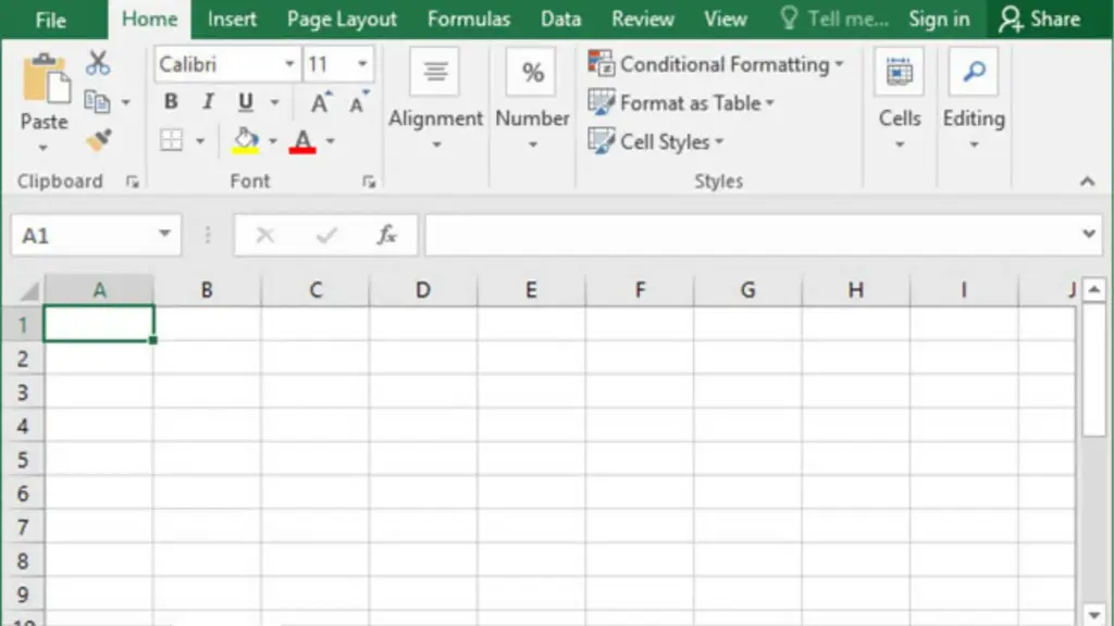
Microsoft Excel is a spreadsheet tool that allows users to organise data, perform calculations, and build models. It has been a core business tool for decades because it is flexible, familiar, and easy to adapt to almost any problem.
In practical terms, Excel is where teams:
- Build financial models
- Run forecasts and scenarios
- Explore data freely
- Answer one‑off questions quickly
Example:
A finance team testing different pricing scenarios or adjusting assumptions in a forecast will almost always choose Excel. The flexibility to change formulas, tweak inputs, and see instant results is exactly what Excel is designed for.
Excel remains invaluable for thinking with data.
Where it starts to struggle is when those same spreadsheets are reused as leadership reports month after month.
What is Power BI?
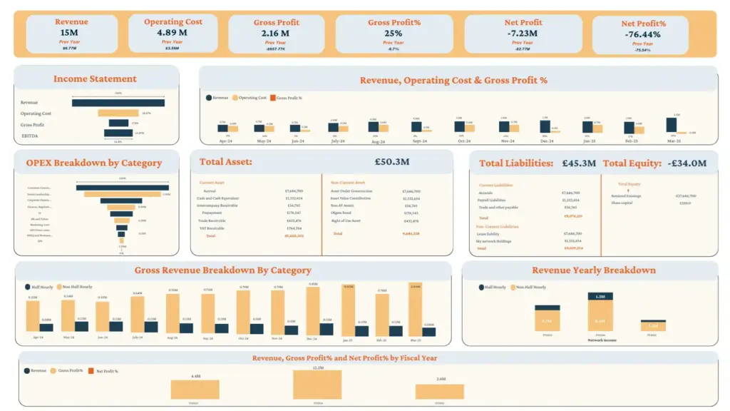
Power BI is Microsoft’s business intelligence platform, designed for reporting, monitoring, and decision visibility at scale.
Rather than working with individual files, Power BI connects directly to live data sources and presents the results through interactive dashboards. These dashboards are shared centrally, updated automatically, and accessed by many people at once.
Example:
Instead of receiving a monthly sales spreadsheet, a leadership team can open a Power BI dashboard that shows current performance by region, product, or channel, and drill into details during the discussion without asking for a follow‑up report.
The most important difference for leaders is consistency. In Power BI, metrics are defined once and reused everywhere. Everyone sees the same numbers, calculated the same way.
Why does this comparison matter in 2026?
Data Has Outgrown Spreadsheet‑Led Reporting
Spreadsheets work well for slices of data. They become fragile when data volumes grow or when multiple teams rely on the same files.
Example:
An operations report built in Excel may work well for one site. Replicating that report across ten sites often results in ten slightly different versions – each with its own assumptions and manual adjustments.
Power BI handles this by using a single data model and applying it consistently across the organisation.
Faster Decisions
Spreadsheets explain what happened. Dashboards highlight what needs attention.
Example:
In Excel, spotting a sudden drop in margin may require scanning rows or waiting for the next report.
In Power BI, the same issue can be flagged automatically on a dashboard, prompting immediate discussion.
This shift from reviewing reports to monitoring performance changes how leaders engage with data.
Trust in Numbers Is a Leadership Issue
As organisations grow, version control becomes a real risk.
Example:
A board pack includes three spreadsheets from three functions, all reporting “revenue” slightly differently. Time is lost reconciling figures instead of discussing decisions.
Power BI reduces this friction by enforcing shared definitions and controlled access. The conversation moves forward faster because the numbers are trusted.
AI Has Changed How Leaders Interact With Data
Power BI now includes AI‑assisted features that allow leaders to ask questions in plain language and receive immediate visual answers.
Example:
Instead of asking an analyst, “Can you break this down by customer segment?”, a leader can interact directly with the dashboard and see the answer instantly – often with a written summary explaining what changed and why.
Excel does not offer this level of guided, conversational insight at scale.
Where Excel Fits Best?
Excel remains the right tool when flexibility matters more than repeatability.
Typical use cases include:
- Financial modelling and forecasting
- Scenario and sensitivity analysis
- Ad hoc investigations
- Bespoke, one‑off analysis
Example:
A CFO exploring the financial impact of three acquisition scenarios will almost certainly do that work in Excel first.
Excel is not the problem. Using Excel as a long‑term reporting platform usually is.
Where Power BI Becomes Essential?
Power BI comes into its own when insight needs to be shared, trusted, and acted on across teams.
It is best suited for:
- Executive and board reporting
- Ongoing performance monitoring
- Cross‑functional alignment
- Real‑time or near‑real‑time visibility
- Governed, repeatable reporting
Example:
A COO tracking delivery performance across regions benefits far more from a live Power BI dashboard than from weekly spreadsheet updates.
How Microsoft Fabric Strengthens Power BI?
Power BI comes under Fabric. Fabric includes data engineering, ML, data analysis, and reporting. In simple terms, Fabric brings data engineering, storage, and analytics into one unified foundation. Instead of data being copied across systems or stitched together manually, Power BI draws from a single, governed source.
What this means for leaders:
- Fewer discrepancies between reports
- Stronger governance and auditability
- Better performance as data volumes grow
- A clearer path to scaling analytics across the organisation
Fabric does not replace Excel. It strengthens Power BI by giving it a more reliable foundation.
What Strong Organisations Do Differently?
Organisations that use both tools well tend to be clear about intent.
They use Excel for depth and flexibility: bespoke modelling, scenario planning, and exploratory work.
They use Power BI for visibility and trust: executive reporting, real-time monitoring, and cross-functional alignment.
They design dashboards around decisions, not around every available metric.
They invest in shared definitions and governance before rolling out executive dashboards. Without this foundation, dashboards simply visualise chaos more quickly.
They adopt AI capabilities thoughtfully, using natural language querying and automated summaries to reduce friction and cognitive load, but keeping strategic judgement firmly in human hands.
Most importantly, they treat insight as a leadership capability, not just a reporting task.
Next Step
Moving from spreadsheet‑led reporting to a Power BI‑driven executive layer raises important questions:
- Which metrics genuinely belong at leadership level?
- Where should governance sit without slowing teams down?
- How much self‑service is helpful and when does it create risk?
At Synapx, we work with leadership teams to answer those questions before tools are rolled out. The focus is not on replacing Excel, but on designing reporting and decision systems that scale with confidence.
If your organisation is rethinking how leaders consume insight, a short, structured conversation can often clarify the right path forward.
Final Thought
Excel remains essential for analysis.
Power BI has become essential for leadership visibility and trust.
The real question is not which tool is better, but:
What does leadership need to see, when do they need to see it, and how confident do they need to be to act?
When that is clear, the choice usually follows.
Elevate Decision‑Making with Synapx’s Power BI Advisory
In an increasingly data‑led business environment, clarity and confidence in decision‑making matter more than ever. Synapx works with organisations to design Power BI ecosystems that go beyond reporting, helping leadership teams see the business clearly, consistently, and at the right moment.
We take a strategic approach to Power BI, combining decision design, governance, and scalable architecture to turn fragmented data into trusted, decision‑ready insight. From executive dashboards and semantic models to governance frameworks and Microsoft Fabric‑enabled foundations, we help organisations create reporting that leaders can rely on.
With experience supporting enterprises across industries including finance, manufacturing, retail, and healthcare, Synapx understands the real challenges behind modern analytics adoption. Our focus is not on deploying tools, but on shaping insight systems that improve alignment, strengthen confidence, and support better decisions as organisations scale.
If you’re rethinking how leadership consumes and trusts data, Synapx can help you design a Power BI foundation that works for the business today, and grows with it tomorrow.